The Math Says Bitcoin Is Deeply Mispriced
With markets getting hit again, it’s easy to fall into chart-watching mode and treat every dip like a verdict. Analyst David took the opposite route in his latest post. He focused on a long-horizon valuation lens that tries to answer a different question: is Bitcoin’s current price sitting far away from its historical “gravity line,” or is this just normal noise?
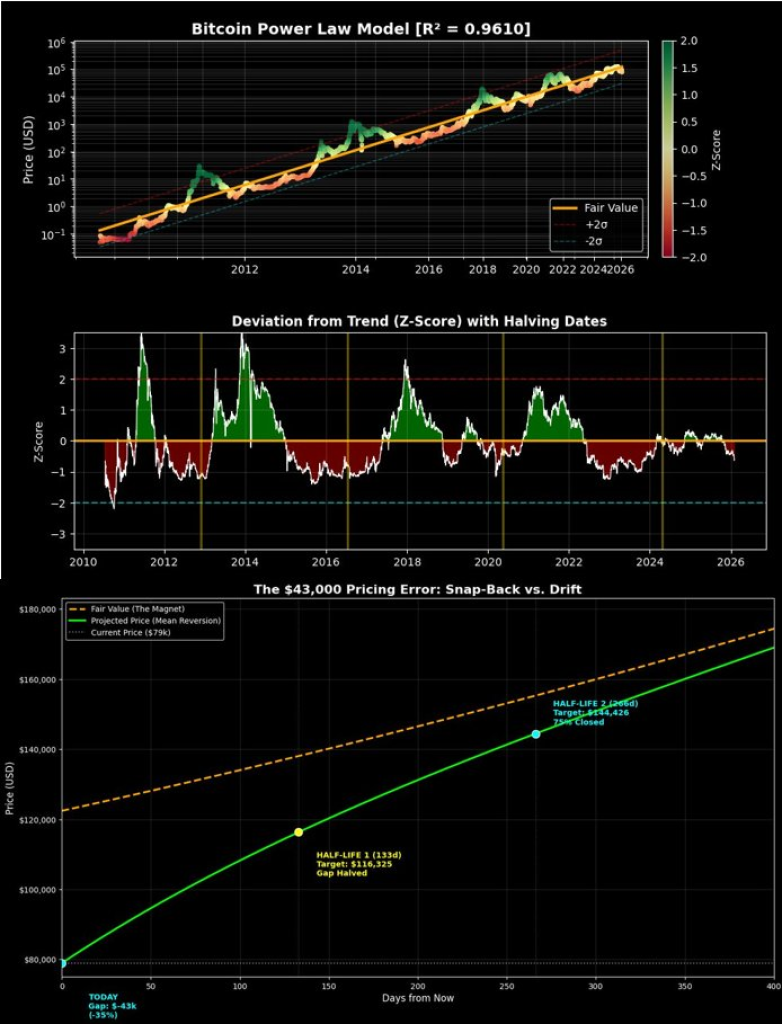
His chart stacks three views of the same idea: a 15-year power-law trend, a deviation gauge (Z-score), and a mean-reversion path that estimates how fast big pricing gaps have closed in the past.
Chart 1: The power-law “fair value” line
The top panel is labeled “Bitcoin Power Law Model (R² = 0.9610)” and it’s plotted on a log scale. That matters. A log scale compresses huge moves and makes long-term structure easier to see, which is useful for an asset that has gone from pennies to tens of thousands.
You can see three key ingredients:
First is the price history (the colored path). The color bar on the right maps Z-score values, so green zones sit above trend and red zones sit below.
Second is the “Fair Value” line (the orange/yellow line). David treats this as the long-run trend Bitcoin has gravitated around across multiple cycles.
Third are the bands around that line, marked +2σ and −2σ. Those act like a historical “lane.” When price hugs the upper band, the market has been stretched to the upside. When it presses the lower band, it has been stretched to the downside.
David’s main claim comes from where price sits today versus that fair-value line. In his notes, he puts fair value near $122K and spot near $79K, creating a gap of roughly $43K.
 Source: X/@david_eng_mba
Chart 2: Deviation from trend and where we sit now
The middle panel, “Deviation from Trend (Z-Score) with Halving Dates,” turns the same story into a single oscillator. The orange horizontal line is the trend itself (Z = 0). Readings above zero mean price is above trend; readings below zero mean price is below trend.
The visual pattern is familiar. Big cycle peaks push Z-score into positive extremes, then cooling phases drag it down into negative territory. The vertical yellow markers show halving dates, giving you an anchor for where these swings landed across eras.
David labels the current reading as oversold with a Z-score around −0.63. That is not “capitulation territory” in the classic sense (you can see past moments that went far lower), but it does place price on the undervalued side of the long-term line.
The key takeaway from this panel isn’t “it must bounce tomorrow.” It’s that the market is currently pricing Bitcoin below a trendline that has held up through multiple booms and busts.
Read also: Here’s How High Ripple’s XRP Price Can Go This Week
Chart 3: “Snap-back vs. drift” and the half-life idea
The bottom panel is the most ambitious part. It’s titled “The $43,000 Pricing Error: Snap-Back vs. Drift.” Here David frames the gap between spot and fair value as an error that historically shrinks over time.
There are three lines to watch:
The dashed orange path is drift: a slow grind higher that never fully “catches” the fair-value line quickly.
The green curve is mean reversion: a faster catch-up path that closes a big part of the gap earlier, then slows as it gets closer to trend.
And the fair-value “magnet” sits above them, acting like the reference point the model tries to return toward.
He adds two labeled checkpoints based on an estimated half-life of 133 days. In simple terms, half-life is the time it took, on average, for half of a mispricing gap to close in past episodes that looked similar.
On the chart, the first checkpoint sits around 133 days with the note “Gap Halved,” and the second sits around roughly 266 days with “Gap Cflosed.” From that, he projects a path that reaches the low-to-mid $100Ks later in 2026 and pushes higher into early 2027.
Even if you ignore the exact price targets, the mechanical point is clear: when Bitcoin has sat meaningfully below its long-run trend, it hasn’t tended to stay there for long stretches. The model expects the gap to compress, and it tries to quantify the pace.
What’s strong here, and what to be careful with
This framework has two real strengths.
One, it forces a long-term view. Most people only zoom in during drawdowns, which makes every move feel existential. A 15-year lens reminds you Bitcoin has lived through long bear markets and still maintained an upward adoption curve.
Two, the deviation panel gives a clean “where are we on the spectrum” gauge. It’s a useful way to compare today with prior cycles without getting lost in narratives.
That said, this is not a guaranteed roadmap.
R² being high does not mean the model can call the next 3–6 months with precision. It means the trendline fits the broad history well. Markets can stay below “fair value” longer than traders expect, especially in ugly macro stretches.
Mean reversion also depends on the sample you choose. Bitcoin has a limited number of full cycles, and the market structure keeps changing as it grows. What looked like a clean snap-back in earlier eras can turn into a slower grind in a more mature market.
Subscribe to our YouTube channel for daily crypto updates, market insights, and expert analysis.
The post The Math Says Bitcoin Is Deeply Mispriced appeared first on CaptainAltcoin.


You May Also Like

Why Is Crypto Down Today: Pepeto Crosses $8.6 Million as XRP Price Prediction Tests $1.30 and ETH Fights for $2,000

Coinbase Receives OCC Approval for National Trust Charter