Bitcoin’s Market Cap Is Growing Slower Than Its Realized Cap: Here Is What That Gap Means
On-chain data from CryptoQuant shows Bitcoin’s market cap growth rate falling below its realized cap growth rate, a divergence that has historically preceded periods of increased selling pressure.
What These Two Metrics Actually Measure
Market cap is simple: current price multiplied by circulating supply. Realized cap is different. It values each Bitcoin at the price it last moved on-chain, essentially the aggregate cost basis of the entire network. When market cap grows faster than realized cap, speculative demand is outpacing actual capital inflows. Buyers are pushing price above what coins are collectively worth at their entry points.
 The relationship between the two is what matters. Not the levels. The gap.
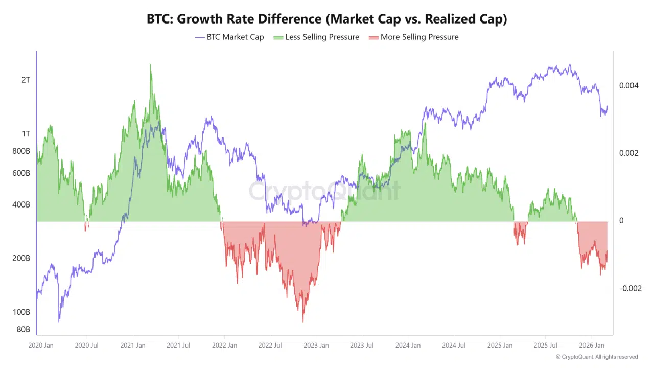
What the First Chart Shows
The growth rate difference chart covers January 2020 through early 2026. Green shading indicates periods when market cap is growing faster than realized cap, meaning less selling pressure. Red shading marks the opposite, when realized cap growth outpaces market cap, meaning more selling pressure is present.
The 2021 bull run produced the largest green spike on the chart, peaking well above the zero line as speculative demand drove price well ahead of cost basis. Then 2022 flipped it entirely. The red zone deepened through mid-2022 and into early 2023, the worst reading on the chart, coinciding with Bitcoin’s drop toward $15,000.
The recovery from late 2023 through 2024 brought the reading back into green. Market cap was leading again. But the chart shows that relationship reversing again heading into early 2026, with red shading returning and the differential dropping back below zero.
What the Second Chart Confirms
The 365-day simple moving average chart smooths out the noise. The orange line tracks market cap growth rate on a rolling annual basis. The blue line tracks realized cap growth rate the same way.
During the 2021 peak, orange ran far above blue. During the 2022 bear market, orange collapsed below zero while blue followed more slowly. The two lines converged around mid-2023 before orange recovered sharply through 2024. Into early 2026, the orange line has crossed back below the blue line and is now dipping toward negative territory. The blue line remains modestly positive.
That crossover is the signal. Realized cap is expanding steadily, meaning capital is still entering the network. But market cap growth has slowed faster. Price is not keeping pace with the cost basis expansion happening on-chain.
What the Divergence Suggests
This pattern is consistent with a distribution phase, where holders are moving coins at profit, raising the realized cap, while price momentum slows or stalls. It does not confirm a market top. It signals that additional demand is needed to sustain upside from here.
If market cap growth recovers relative to realized cap growth, the structure turns constructive again. If it does not, the current reading suggests the market is gradually absorbing elevated sell-side pressure without enough fresh demand to overcome it.
The data points in one direction. It does not predict how far that direction runs.
The post Bitcoin’s Market Cap Is Growing Slower Than Its Realized Cap: Here Is What That Gap Means appeared first on ETHNews.


You May Also Like

Anthropic code leak exposes Claude AI internals after release error

ASML (ASML) Stock; Slips as High-NA Chips Near First Production Milestone