Consensus Loss Proves AI Can Be Both Accurate and Transparent
Table of Links
Abstract and 1. Introduction
1.1 Post Hoc Explanation
1.2 The Disagreement Problem
1.3 Encouraging Explanation Consensus
-
Related Work
-
Pear: Post HOC Explainer Agreement Regularizer
-
The Efficacy of Consensus Training
4.1 Agreement Metrics
4.2 Improving Consensus Metrics
[4.3 Consistency At What Cost?]()
4.4 Are the Explanations Still Valuable?
4.5 Consensus and Linearity
4.6 Two Loss Terms
-
Discussion
5.1 Future Work
5.2 Conclusion, Acknowledgements, and References
Appendix
4.4 Are the Explanations Still Valuable?
Whether our proposed loss is useful in practice is not completely answered simply by showing accuracy and agreement. A question remains about how our loss might change the explanations in the end. Could we see boosted agreement as a result of some breakdown in how the explainers work? Perhaps models trained with our loss fool explainers into producing uninformative explanations just to appease the agreement term in the loss.
\ Hypothesis: We only get consensus trivially, i.e., with feature attributions scores that are uninformative.
\ Since we have no ground truth for post hoc feature attribution scores, we cannot easily evaluate their quality [37]. Instead, we reject this hypothesis with an experiment wherein we add random “junky” features to the input data. In this experiment we show that when we introduce junky input features, which by definition have no predictive power, our explainers appropriately attribute near zero importance to them.
\ Our experimental design is related to other efforts to understand explainers. Slack et al. [33] demonstrate an experimental setup whereby a model is built with ground-truth knowledge that one feature is the only important feature to the model, and the other features are unused. They then adversarially attack the model-explainer pipeline and measure the frequency with which their explainers identify one of the truthfully unimportant features as the most important. Our tactic works similarly, since a naturally trained model will not rely on random features which have no predictive power.
\ We measure the frequency with which our explainers place one of the junk features in the top-𝑘 most important features, using 𝑘 = 5 throughout.
\ As a representative example, LIME explanations of MLPs trained on this augmented Electricity data put random features in the top five 11.8% of the time on average. If our loss was encouraging models to permit uninformative explanations for the sake of agreement, we might see this number rise. However, when trained with 𝜆 = 0.5, random features are only in the top five LIME features 9.1% of the time – and random chance would have at least one junk feature in the top five over 98% of the time. For results on all three datasets and all six explainers, see Appendix A.4.
\ The setting where junk features are most often labelled as one of the top five is when using SmoothGrad to explain models trained on Bank Marketing data with 𝜆 = 0, where for 43.1% of the samples, at least one of the top five is in fact a junk feature. Interestingly, for the same explainer and dataset models trained with 𝜆 = 0.5 lead to explanations that have a junk feature as one of the top five less than 1% of the time, indicating that our loss can even improve this behavior in some settings.
\ Therefore, we reject this hypothesis and conclude that the explanations are not corrupted by training with our loss.
4.5 Consensus and Linearity
Since linear models are the gold standard in model explainability, one might wonder if our loss is pushing models to be more like linear models. We conduct a quantitative and qualitative test to see whether our method indeed increases linearity.
\ Hypothesis: Encouraging explanation consensus during training encourages linearity.
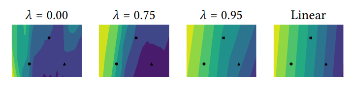
\ Qualitative analysis. In their work on model reproducibility, Somepalli et al. [36] describe a visualization technique wherein a high-dimensional decision surface is plotted in two dimensions. Rather than more complex distance preserving projection tactics, they argue that the subspace of input space defined by a plane spanning three real data points can be a more informative way to visualize how a model’s outputs change in high dimensional input space. We take the same approach to study how the logit surface of our model changes with 𝜆. We take three random points from the test set, and interpolate between the three of them to get a planar slice of input space. We then compute the logit surface on this plane (we arbitrarily choose the logit corresponding to the first class). We visualize the contour plots of the logit surface in Figure 6 (more visualizations in Section A.7). As we increase 𝜆, we see that the shape of the contours often tends toward the contour pattern that a linear model takes on that same plane slice of input space.
\ 
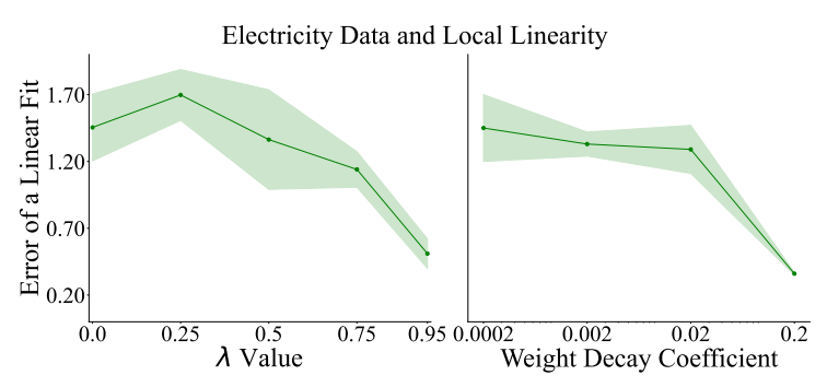
\ Quantitative analysis. We can also measure how close to linear a model is quantitatively. The extent to which our models trained with higher 𝜆 values are close to linear can be measured as follows. For each of ten random planes in input space (constructed using the three-point method described above), we fit a linear regression model to predict the logit value at each point of the plane, and measure the mean absolute error. The closer this error term is to zero, the more our model’s logits on this input subspace resemble a linear model. In Figure 7 we show the error values of the linear fit drop as we increase the weight on the consensus loss for the Electricity dataset. Thus, these analyses support the hypothesis that encouraging consensus encourages linearity.
\ But if our consensus training pushes models to be closer to linear, does any method that increases the linearity measurement also lead to increased consensus? We consider the possibility that any approach to make models closer to linear improves consensus metrics.
\ Hypothesis: Linearity implies more explainer consistency.
\ To explore another path toward more linear models, we train a set of MLPs without our consensus loss but with various weight decay coefficients. In Figure 7, we show a drop in linear-best-fit error across the random three-point planes which is similar to the drop observed by increasing 𝜆, showing that increasing weight decay also encourages models to be closer to linear.
\ But when evaluating these MLPs with increasing weight decay by their consensus metrics, they show near-zero improvement. We therefore reject this hypothesis—linearity alone does not seem to be enough to improve consensus on post hoc explanations.
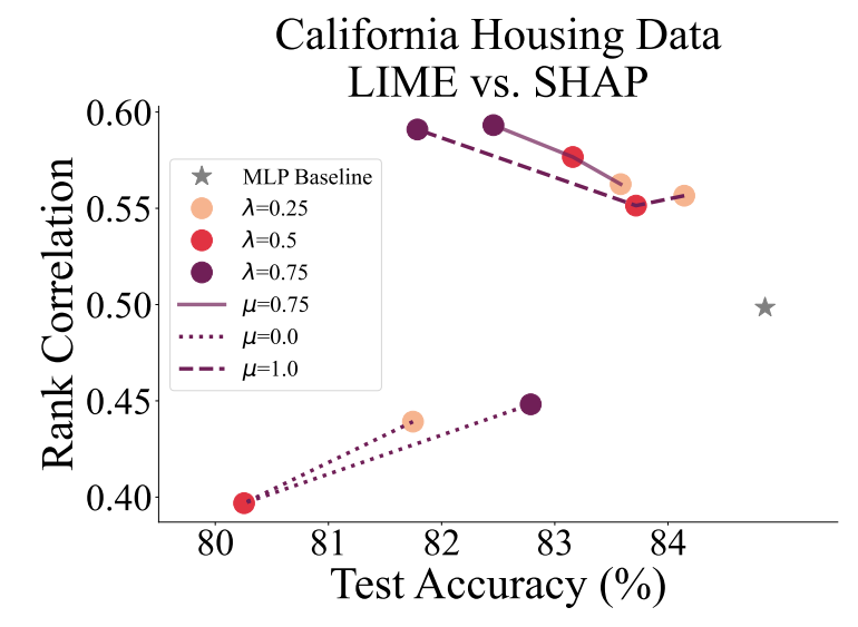
4.6 Two Loss Terms
For the majority of experiments, we set 𝜇 = 0.75, which is determined by a coarse grid search. And while it may not be optimal for every dataset on every agreement metric, we seek to show that the extreme values 𝜇 = 0 and 𝜇 = 1, which each correspond to only one correlation term in the loss, can be suboptimal. This ablation study serves to justify our choice of incorporating two terms in the loss. In Figure 8, we show the agreement-accuracy trade-off for multiple values of 𝜇 and of 𝜆. We see that 𝜇 = 0.75 shows the more optimal trade-off curve.
\ In Appendix A.7, where we show more plots like Figure 8 for other datasets and metrics, we see that the best value of 𝜇 varies case by case. This demonstrates the importance of having a tunable parameter within our consensus loss term to be tweaked for better performance.
\ 
\ 
\
:::info Authors:
(1) Avi Schwarzschild, University of Maryland, College Park, Maryland, USA and Work completed while working at Arthur (avi1umd.edu);
(2) Max Cembalest, Arthur, New York City, New York, USA;
(3) Karthik Rao, Arthur, New York City, New York, USA;
(4) Keegan Hines, Arthur, New York City, New York, USA;
(5) John Dickerson†, Arthur, New York City, New York, USA (john@arthur.ai).
:::
:::info This paper is available on arxiv under CC BY 4.0 DEED license.
:::
\


You May Also Like

Ripple Gets Major Boost For Prime Brokerage Growth: $200M Debt Facility Announced

Best Mobile User Retention Tools in 2026