Buy Crypto
Markets
Spot
FuturesBTC
Earn
Event Center
Rewards Hub
More
MEXC Logo Refresh: Design Meaning and Official Logo AssetsMEXC Logo Refresh: Design Meaning and Official Logo Assets
Category List
Cancel

MEXC Logo Refresh: Design Meaning and Official Logo Assets

Key Takeaways

  • MEXC has introduced a refreshed logo as part of its broader brand evolution.
  • The new symbol evolves the familiar M into a simpler, more fluid, and more open form.
  • Its outline echoes the infinity symbol, while its two connected loops can also be read as two zeros, reflecting the ideas of Infinite Opportunities and 0 Fees.
  • The refreshed identity retains MEXC's signature blue to preserve brand recognition while presenting a more modern visual language.
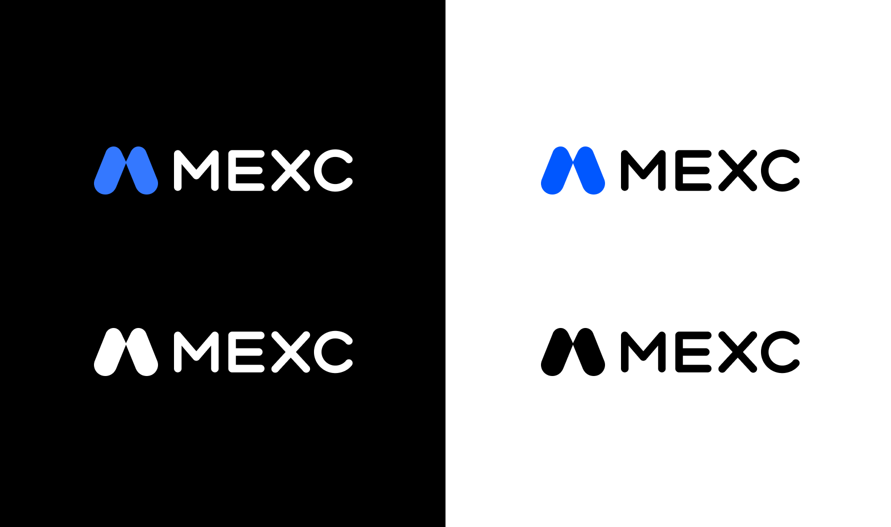
  • Official blue, black, white, and blue-and-white assets are provided for use on light and dark backgrounds.

1. An Overview of the MEXC Logo Refresh


MEXC was established in 2018 and serves users across more than 170 countries and regions. The refreshed logo represents a natural evolution of the brand rather than a break from its past.

The new design preserves the recognizable M at the center of the MEXC identity, while introducing a cleaner and more open shape. This visual update supports MEXC's positioning as "Your 0-Fee Gateway to Infinite Opportunities" and reflects the platform's continued expansion beyond traditional crypto exchange services toward broader market access.

2. What Does the New MEXC Logo Mean?


2.1 A fluid evolution of the M


The symbol evolves from the brand's core M into a simpler and more fluid form. Rounded, continuous lines give the mark a lighter and more dynamic appearance while preserving the recognizable MEXC identity.

This balance between familiarity and change allows the logo to retain established brand recognition while expressing a more modern, global, and user-centered identity.

2.2 An outline that echoes infinity


The overall outline resembles the infinity symbol. In the brand narrative, this represents MEXC's aim to connect users with a broader range of assets, products, market, and opportunities to participate.

Rather than describing a guaranteed outcome, the infinity reference communicates the idea that access to opportunity should continue expanding as the platform and its products evolve.

2.3 Two connected loops, two zeros


The two connected loops can also be interpreted as two zeros. This visual idea reflects MEXC's 0-fee positioning and its efforts to reduce fee-related barriers across eligible products and campaigns.

2.4 A smooth and continuous visual language


The uninterrupted lines create a sense of movement and continuity. This design language mirrors the experience MEXC aims to provide: clear, efficient, and responsive access to products and markets.

2.5 An open and connected structure


The mark appears open and outward-facing rather than enclosed. Its connected structure represents access, expansion, and MEXC's role as a gateway connecting users to a broader range of market opportunities through its platform infrastructure.

2.6 The signature MEXC blue


The refreshed identity retains MEXC's signature blue. Keeping this established color supports visual continuity, while the brighter and cleaner presentation reinforces the brand themes of openness, accessibility, and possibility.

3. Download MEXC Logo Assets


For consistent brand use across media, partner, and community channels, MEXC provides a complete logo asset pack with multiple versions for different backgrounds.


For light backgrounds:

For dark backgrounds:

The new MEXC logo embodies the ideas of infinite opportunities, zero fees, and global access. More than a visual refresh, the new logo reflects MEXC’s vision for the future: open, empowering, and full of infinite opportunities. Download the official logo pack and join MEXC in this new chapter.


MEXC Logo Refresh: Design Meaning and Official Logo Assets

Key Takeaways

  • MEXC has introduced a refreshed logo as part of its broader brand evolution.
  • The new symbol evolves the familiar M into a simpler, more fluid, and more open form.
  • Its outline echoes the infinity symbol, while its two connected loops can also be read as two zeros, reflecting the ideas of Infinite Opportunities and 0 Fees.
  • The refreshed identity retains MEXC's signature blue to preserve brand recognition while presenting a more modern visual language.
  • Official blue, black, white, and blue-and-white assets are provided for use on light and dark backgrounds.

1. An Overview of the MEXC Logo Refresh


MEXC was established in 2018 and serves users across more than 170 countries and regions. The refreshed logo represents a natural evolution of the brand rather than a break from its past.

The new design preserves the recognizable M at the center of the MEXC identity, while introducing a cleaner and more open shape. This visual update supports MEXC's positioning as "Your 0-Fee Gateway to Infinite Opportunities" and reflects the platform's continued expansion beyond traditional crypto exchange services toward broader market access.


2. What Does the New MEXC Logo Mean?


2.1 A fluid evolution of the M


The symbol evolves from the brand's core M into a simpler and more fluid form. Rounded, continuous lines give the mark a lighter and more dynamic appearance while preserving the recognizable MEXC identity.

This balance between familiarity and change allows the logo to retain established brand recognition while expressing a more modern, global, and user-centered identity.

2.2 An outline that echoes infinity


The overall outline resembles the infinity symbol. In the brand narrative, this represents MEXC's aim to connect users with a broader range of assets, products, market, and opportunities to participate.

Rather than describing a guaranteed outcome, the infinity reference communicates the idea that access to opportunity should continue expanding as the platform and its products evolve.

2.3 Two connected loops, two zeros


The two connected loops can also be interpreted as two zeros. This visual idea reflects MEXC's 0-fee positioning and its efforts to reduce fee-related barriers across eligible products and campaigns.

2.4 A smooth and continuous visual language


The uninterrupted lines create a sense of movement and continuity. This design language mirrors the experience MEXC aims to provide: clear, efficient, and responsive access to products and markets.

2.5 An open and connected structure


The mark appears open and outward-facing rather than enclosed. Its connected structure represents access, expansion, and MEXC's role as a gateway connecting users to a broader range of market opportunities through its platform infrastructure.

2.6 The signature MEXC blue


The refreshed identity retains MEXC's signature blue. Keeping this established color supports visual continuity, while the brighter and cleaner presentation reinforces the brand themes of openness, accessibility, and possibility.

3. Download MEXC Logo Assets


For consistent brand use across media, partner, and community channels, MEXC provides a complete logo asset pack with multiple versions for different backgrounds.


For light backgrounds:

For dark backgrounds:

The new MEXC logo embodies the ideas of infinite opportunities, zero fees, and global access. More than a visual refresh, the new logo reflects MEXC’s vision for the future: open, empowering, and full of infinite opportunities. Download the official logo pack and join MEXC in this new chapter.